
Chart Types
Every BI Dashboard is built on charts. These are the visual blocks you’ll add to your canvas to track process performance, ticket status, or action points.
This page introduces all available chart types and what they’re best used for. (Configuration and management are covered in the next two sections.)
Available Charts
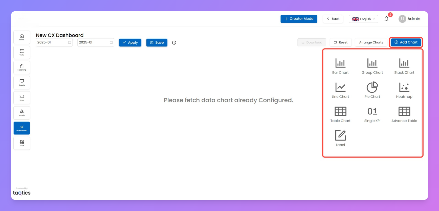
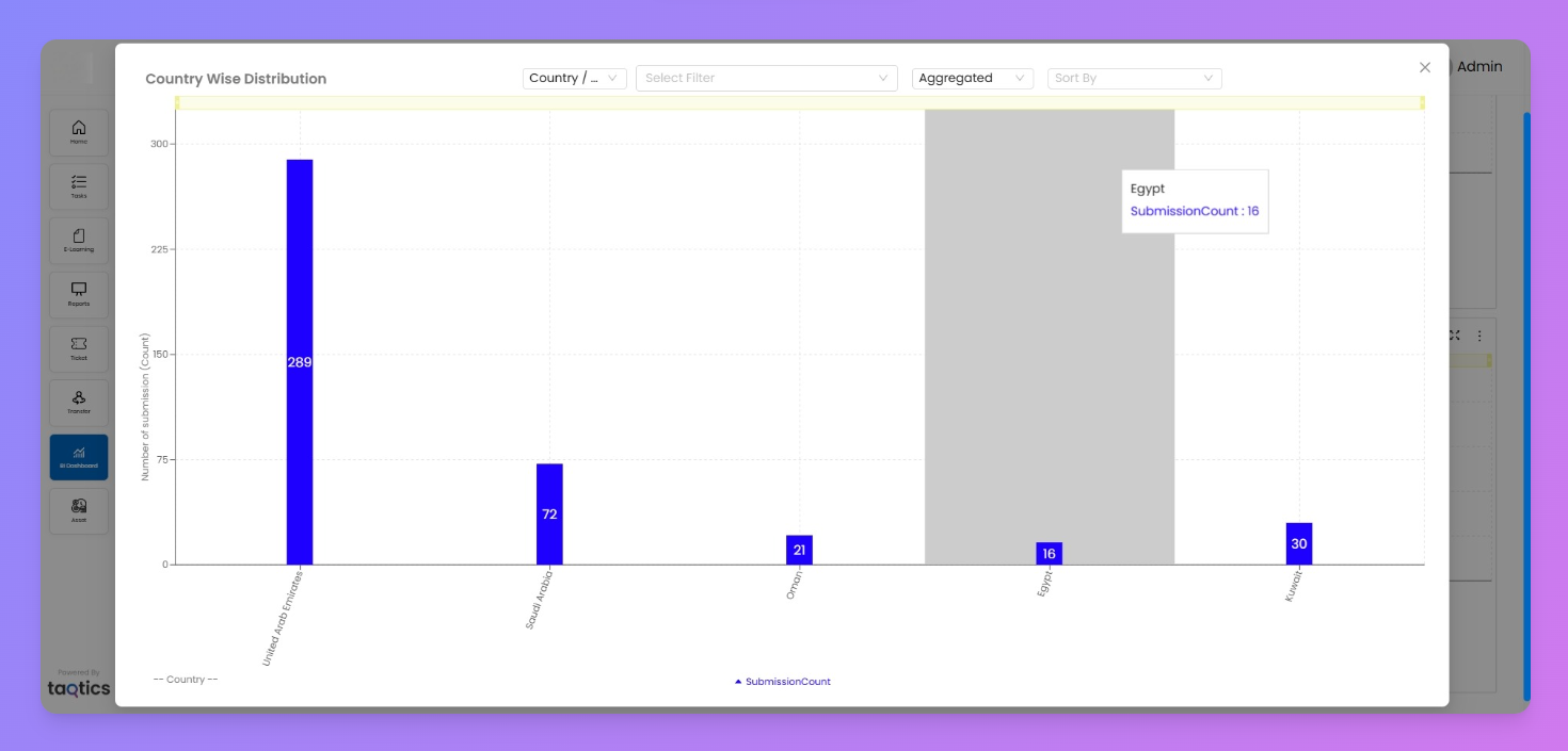
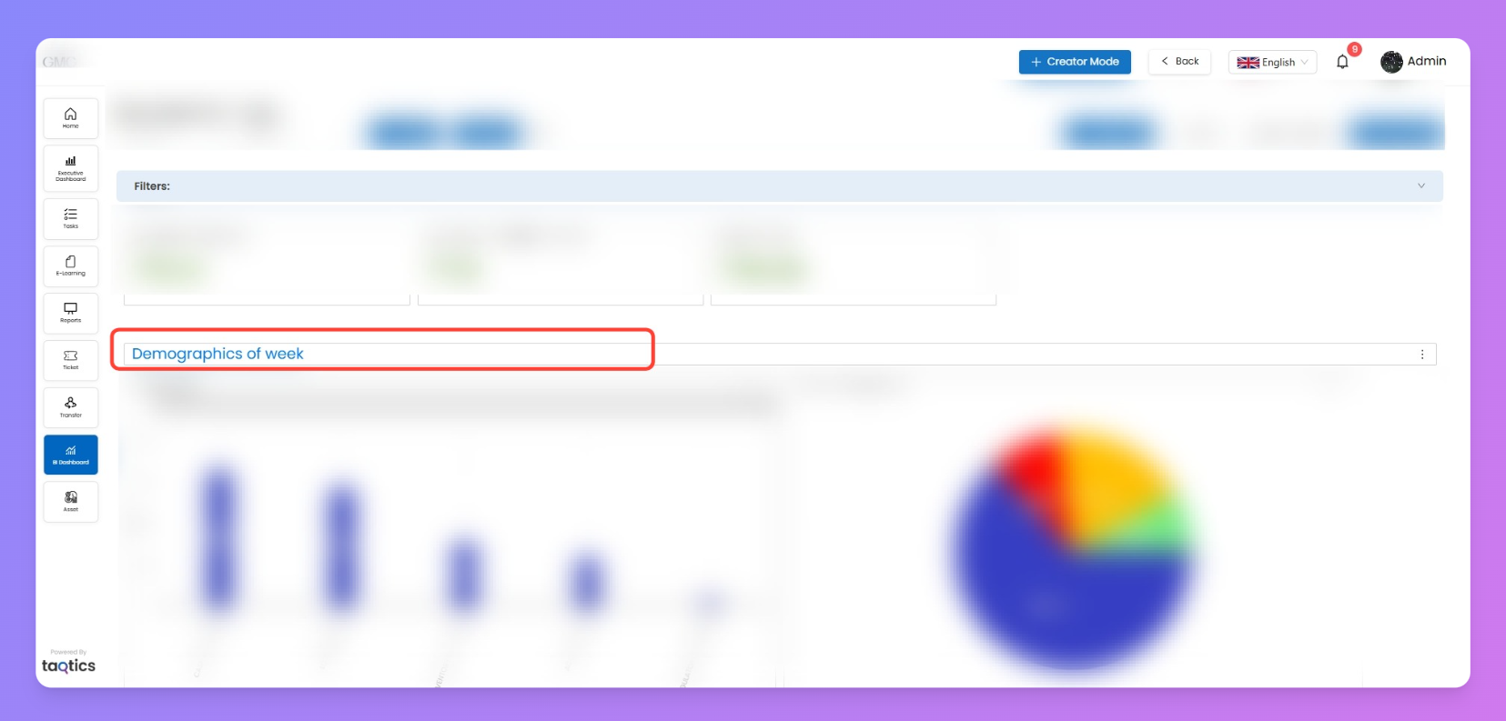
- Bar Chart
- Shows data across a single dimension.
- Best for comparing counts or averages between categories (e.g., number of tickets by store).
- Group Chart
- Multi-series bar chart.
- Lets you compare multiple values side by side (e.g., compliance % by manager across countries).
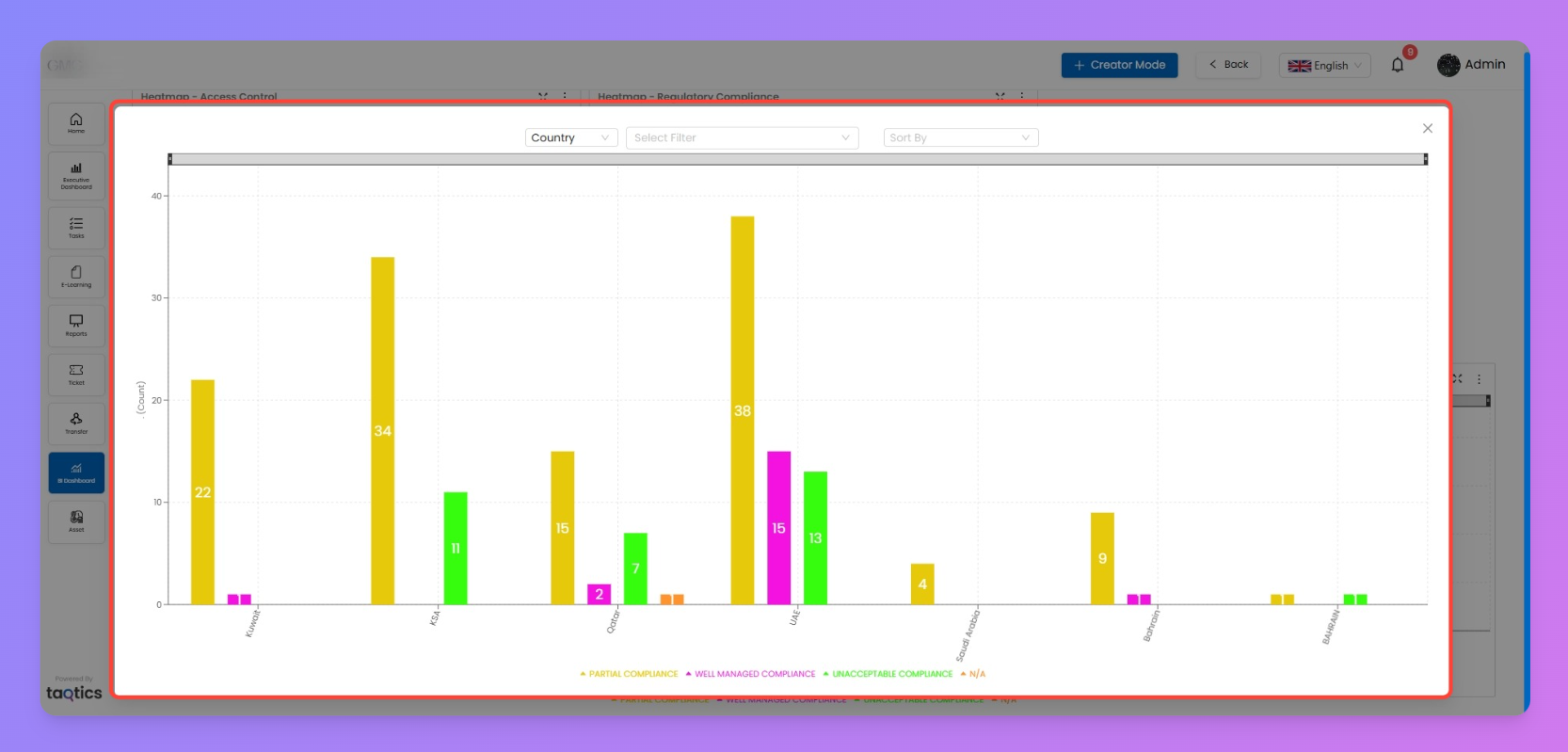
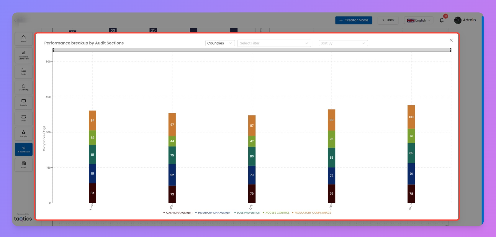
- Stack Chart
- Breaks down values into segments stacked on top of each other.
- Useful for showing totals plus distribution (e.g., action points by status).
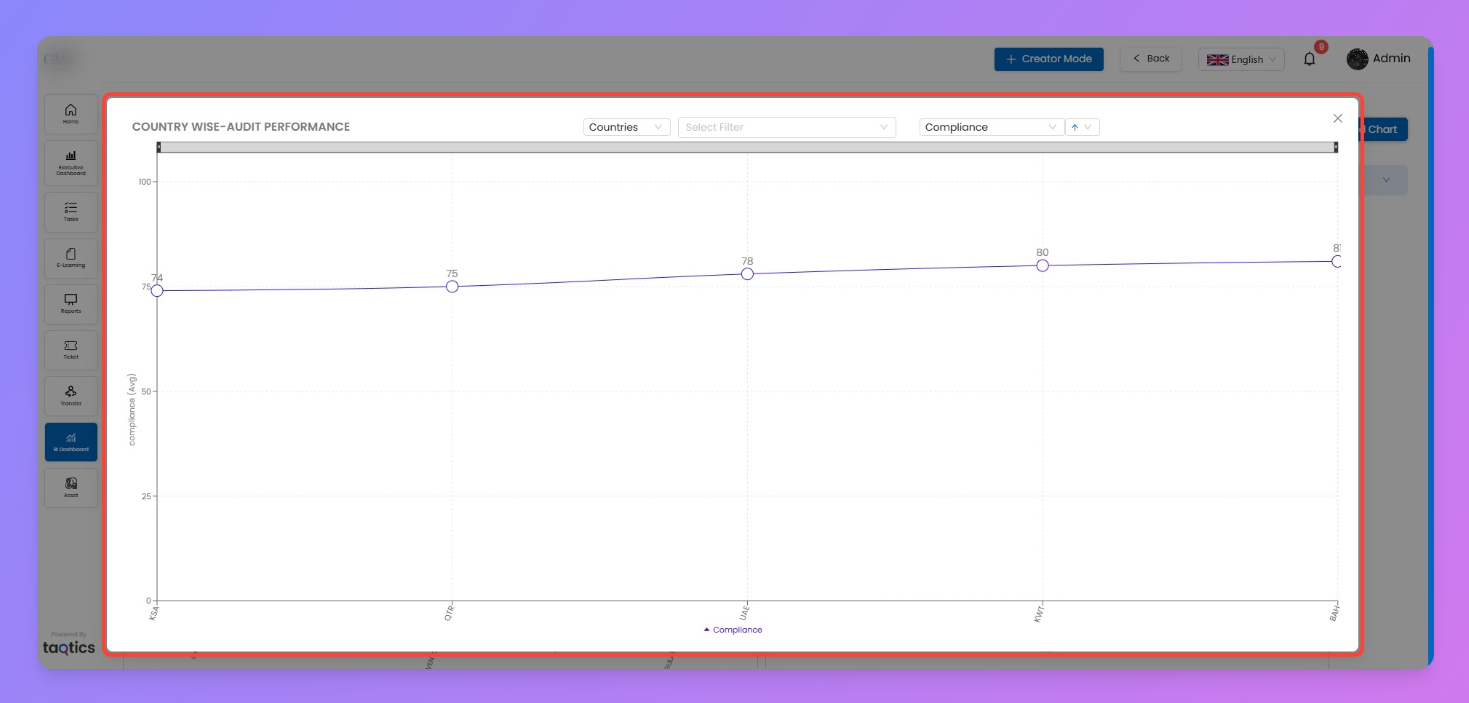
- Line Chart
- Displays trends over time.
- Ideal for daily/monthly submissions, closures, or compliance scores.
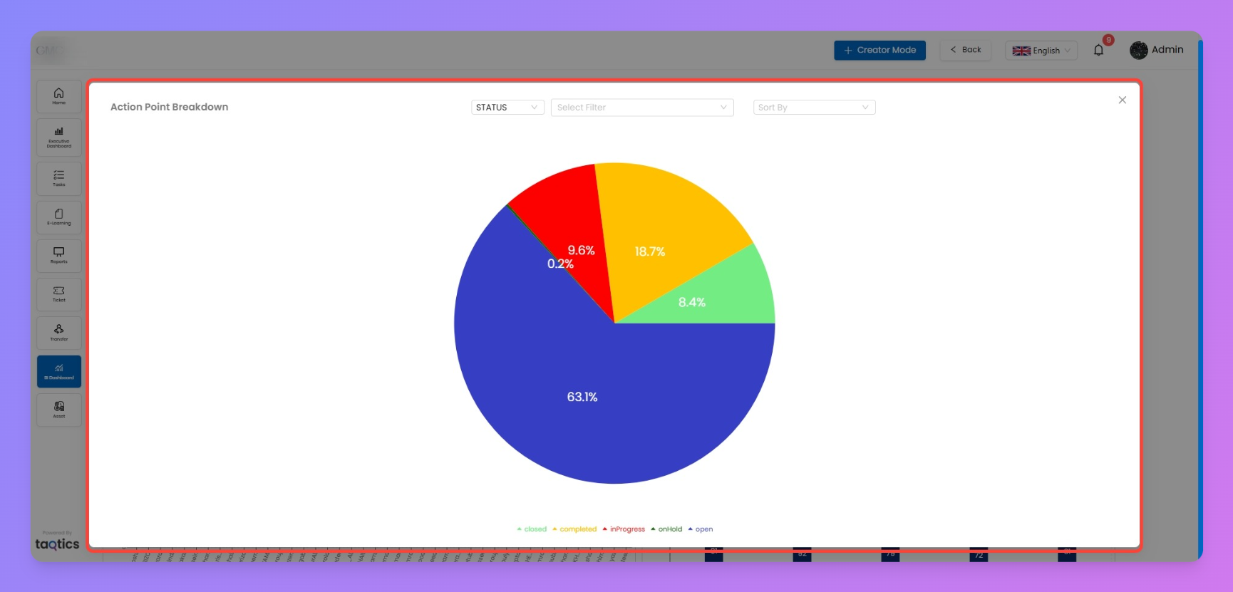
- Pie Chart
- Shows proportions within a whole.
- Great for breakdowns like ticket status (open vs. closed) or action point categories.
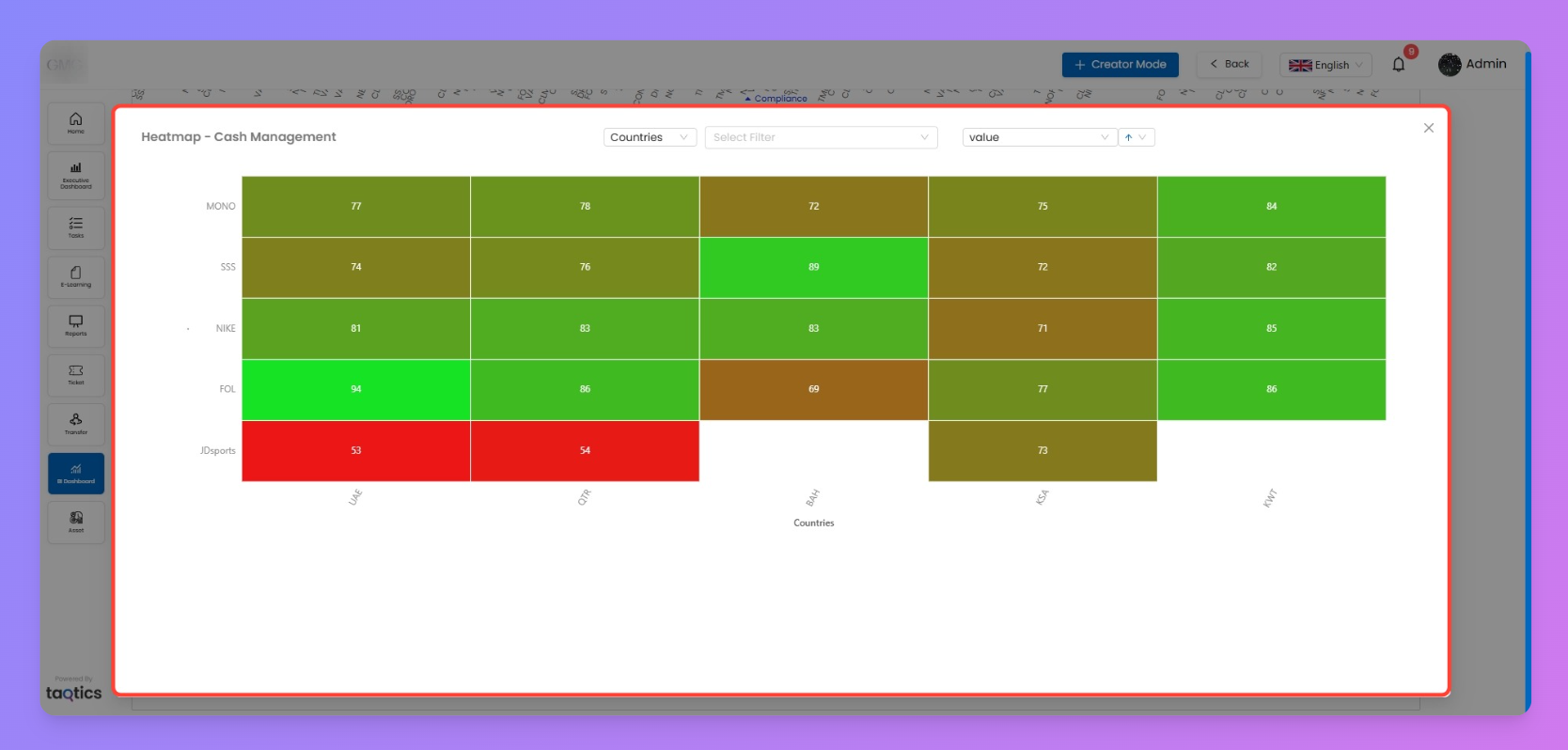
- Heatmap
- Cross-tab view with color-coded performance.
- Perfect for comparing compliance or scores across multiple dimensions (e.g., country vs. process).
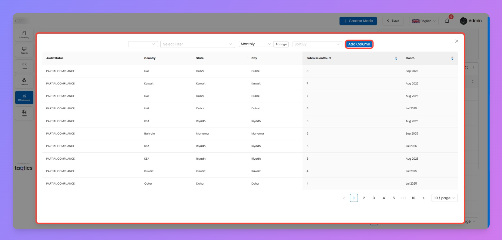
- Table Chart
- Simple grid view with summarized values.
- Use when you need raw data visibility alongside visuals.
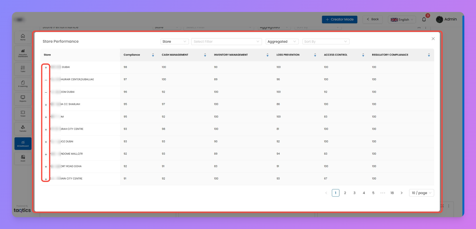
- Advanced Table Chart
- Table with multi-level aggregations.
- Best for combining multiple metrics in one view.
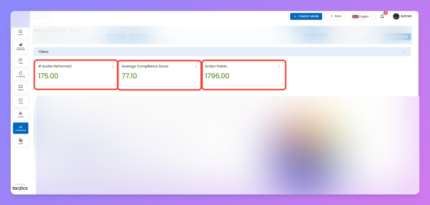
- Single KPI Chart
- Highlights one metric (e.g., average score, total tickets).
- Great for quick insights at a glance.
- Label Chart
- A text-based label you can drop into dashboards.
- Useful for headings, grouping sections, or adding context.
Notes
- Each chart can be configured with your data fields, filters, and colors.
- For how to configure these charts, refer to the Configuring Charts page.
- For how to manage them on your dashboard (resize, move, download), check the Managing Dashboards page.