
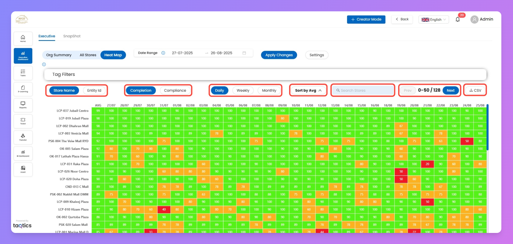
The Heat Map flips your store data into a color-coded grid so you can spot wins and problems at a glance. It’s the fastest way for managers to see how each store is performing day by day, week by week, or month by month, and dive into details with a single tap.
The heatmap will display only the data from processes or audits that have been marked as Priority One in their properties.
How to set the priority as? Check here 👇
Set Process Properties
Filters
Filter / Control | What it does (plain English) |
Date Range | Pick exactly when you want to see results for (start and end date). |
Tag Filters | Filter by Brand, Area Manager, Chain Manager, or any custom tag. |
Store Name / Entity ID | Show stores by friendly name or by their master code. |
Metric Toggle | Switch between completion and compliance stats. |
Periodicity | Jump between daily, weekly, and monthly views—flip cadence anytime. |
Sort By Average | Reorder stores by highest or lowest average performance. |
Search Stores | Quickly find a specific store from the list. |
Pagination | See results fifty stores at a time—click "Next" for more. |
Download CSV | One click exports the grid so you can slice and dice the data offline. |
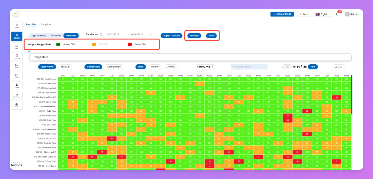
Adjust Your View (Settings)
Settings lets you control how your Heat Map colors and thresholds work, so your team can instantly spot what’s good or bad based on your standards.
- Click Settings at the top of the page to open edit mode.
- Change the green/amber/red percentage bands as you want.
- Instantly see a live preview of your updates in the grid.
- Click Save to confirm and lock in your changes.
How to read Heat Map
Periodicities (how data is split)
- Daily/Weekly/Monthly: Each view uses stores and processes scheduled for that cadence; daily forms in the daily view, weekly forms in weekly, and so on.
KPI Grid (for each periodicity)
KPI | What it means |
Store Name / Entity ID | Who’s on the Y-axis: either store name or unique code |
Date (X-Axis) | What days/weeks/months you’re scanning |
Cell Percent | How much that store got done (completion/compliance) for that time period |
Color Band | Green/good (>80%), amber/ok (60–80%), red/needs help (<60%) |
Charts (per periodicity)—What a cell means
- Each cell is a mini-score for that store on that day/week/month.
- Green = crushing it, yellow = middling, red = lagging.
- The grid fills with big or little blocks, so tough spots pop out fast.
How to Read a Cell (Example)
- E.g., cell for LCP-019 (your store) on 02/08 is green with “100” — that store was 100% Completed or Compliant for that day.
- Red cell? Click it. You’ll see which tasks were missed and how many.
Drill-down Flow (Heat Map → Store Details)
- Scan grid for colors—find areas you care about.
- Click a cell for breakdown of total Process /Audits (what was assigned/submitted).
- Tap through any Process to check for full submissions report (see who did what, when).
Tips & Best Practices
- Sort by average to surface top/bottom performers instantly.
- Download CSV for deep dives and reporting.
- Adjust bands in settings so your definition of “good” matches your ops culture.
- Use heat map for stand-up meetings: everyone sees at a glance where to celebrate or where work needs focus.